Code
import talib
import yfinance as yf
import pandas as pd
import matplotlib.pyplot as plt
import btimport talib
import yfinance as yf
import pandas as pd
import matplotlib.pyplot as plt
import bt# Parameters
ticker = 'MU' # for bt.get use lowercase; yfinance uses uppercase ticker '000660.KS'
start = '2022-01-01'
end = None # or '2025-11-06'
stock_data = ticker
print(stock_data)MU# ===== Cached price loader (shared by the whole notebook) =====
# Avoids Yahoo rate-limiting (the truncated ~75-row stub) by downloading once and caching
# to a local CSV; later runs read from disk instead of re-hitting Yahoo. Set REFRESH = True
# to force a fresh pull (e.g. to pick up new trading days), or delete the _cache_*.csv files.
import os
import time
OHLCV = ['Open', 'High', 'Low', 'Close', 'Volume']
REFRESH = False
def _is_full(d, start):
"""True if the frame reaches back to ~the requested start (i.e. not a throttled stub)."""
return d is not None and len(d) and d.index.min() <= pd.Timestamp(start) + pd.Timedelta(days=30)
def load_ohlcv(tkr, start, end, tries=3):
"""Load OHLCV from a local cache; download once (with retry) if needed, then cache it."""
cache_file = f'_cache_{tkr}_{start}.csv'
if not REFRESH and os.path.exists(cache_file):
d = pd.read_csv(cache_file, index_col=0, parse_dates=True)
if _is_full(d, start):
return d[OHLCV].dropna()
out = None
for _ in range(tries):
d = yf.download(tkr, start=start, end=end, auto_adjust=True, progress=False)
if isinstance(d.columns, pd.MultiIndex): # single ticker -> flatten columns
d.columns = d.columns.get_level_values(0)
d = d[OHLCV].dropna()
out = d
if _is_full(d, start):
d.to_csv(cache_file) # persist full history so future runs skip Yahoo
return d
time.sleep(1.5) # got a throttled stub -> brief pause, then retry
return out# ===== Professional interactive charts: data + indicators =====
# Candlesticks need OHLC. Reuse the cached OHLCV from stock_data when complete, else load it
# via the shared cached loader (load_ohlcv) — both avoid Yahoo throttling.
import plotly.graph_objects as go
from plotly.subplots import make_subplots
def get_ohlcv():
"""Prefer OHLCV already in memory (stock_data) if complete, else load from cache/download."""
if isinstance(stock_data, pd.DataFrame):
src = stock_data.copy()
if isinstance(src.columns, pd.MultiIndex):
src.columns = src.columns.get_level_values(0)
if set(OHLCV).issubset(src.columns):
d = src[OHLCV].dropna()
if _is_full(d, start): # only reuse in-memory data if it is NOT a throttled stub
return d
return load_ohlcv(ticker.upper(), start, end)
df = get_ohlcv()
close = df['Close']
# --- Moving averages (trend & momentum) ---
df['SMA_4'] = talib.SMA(close, timeperiod=4)
df['SMA_9'] = talib.SMA(close, timeperiod=9)
df['SMA_18'] = talib.SMA(close, timeperiod=18)
df['EMA_5'] = talib.EMA(close, timeperiod=5)
df['EMA_13'] = talib.EMA(close, timeperiod=13)
# --- MACD (12, 26, 9): fast/slow EMA spread + 9-period signal line ---
df['MACD'], df['MACD_signal'], df['MACD_hist'] = talib.MACD(
close, fastperiod=12, slowperiod=26, signalperiod=9)
# --- Bollinger Bands: 20-day SMA +/- 2 standard deviations ---
df['BB_upper'], df['BB_mid'], df['BB_lower'] = talib.BBANDS(
close, timeperiod=20, nbdevup=2, nbdevdn=2, matype=0)
# --- Crossover / signal logic (all centralised here) ---
# 4/9/18 SMA: bullish when fully aligned 4 > 9 > 18 (9-day confirms the 4-day warning)
sma_bull = (df['SMA_4'] > df['SMA_9']) & (df['SMA_9'] > df['SMA_18'])
sma_buy = sma_bull & ~sma_bull.shift(1, fill_value=False)
sma_sell = ~sma_bull & sma_bull.shift(1, fill_value=False)
# 5/13 EMA momentum: bullish when 5-day EMA above 13-day EMA
ema_bull = df['EMA_5'] > df['EMA_13']
ema_buy = ema_bull & ~ema_bull.shift(1, fill_value=False)
ema_sell = ~ema_bull & ema_bull.shift(1, fill_value=False)
# MACD: bullish when MACD line is above its signal line (crossover of MACD by signal line)
macd_bull = df['MACD'] > df['MACD_signal']
macd_buy = macd_bull & ~macd_bull.shift(1, fill_value=False)
macd_sell = ~macd_bull & macd_bull.shift(1, fill_value=False)
# Bollinger: price touching the lower band = oversold (buy), upper band = overbought (sell)
bb_buy = close <= df['BB_lower']
bb_sell = close >= df['BB_upper']
# --- Shared "trading terminal" look for every interactive chart ---
PRO_LAYOUT = dict(
template='plotly_dark',
font=dict(family='Arial', size=12),
hovermode='x unified',
legend=dict(orientation='h', yanchor='bottom', y=1.02, xanchor='right', x=1),
margin=dict(l=40, r=40, t=70, b=40),
)
def price_volume_base(title):
"""A candlestick price panel + volume sub-panel, ready for indicator overlays."""
fig = make_subplots(rows=2, cols=1, shared_xaxes=True,
row_heights=[0.75, 0.25], vertical_spacing=0.03,
subplot_titles=('', 'Volume'))
fig.add_trace(go.Candlestick(
x=df.index, open=df['Open'], high=df['High'], low=df['Low'], close=df['Close'],
name='Price', increasing_line_color='#26a69a', decreasing_line_color='#ef5350'),
row=1, col=1)
vol_colors = ['#26a69a' if c >= o else '#ef5350' for o, c in zip(df['Open'], df['Close'])]
fig.add_trace(go.Bar(x=df.index, y=df['Volume'], name='Volume',
marker_color=vol_colors, showlegend=False), row=2, col=1)
fig.update_layout(**PRO_LAYOUT, height=700, title=title,
xaxis_rangeslider_visible=False)
return fig
print('Loaded', len(df), 'rows for', ticker.upper(),
f'({df.index.min().date()} -> {df.index.max().date()})')
print('4/9/18 SMA ->', 'BULLISH (long)' if sma_bull.iloc[-1] else 'BEARISH (flat)')
print('5/13 EMA ->', 'BULLISH (long)' if ema_bull.iloc[-1] else 'BEARISH (flat)')
print('MACD ->', 'BULLISH (long)' if macd_bull.iloc[-1] else 'BEARISH (flat)')Loaded 1117 rows for MU (2022-01-03 -> 2026-06-16)
4/9/18 SMA -> BULLISH (long)
5/13 EMA -> BULLISH (long)
MACD -> BEARISH (flat)# ----- Interactive 4 / 9 / 18-day SMA crossover dashboard -----
fig = price_volume_base(f'{ticker.upper()} - 4/9/18 day SMA crossover')
for col, color in [('SMA_4', '#42a5f5'), ('SMA_9', '#ffa726'), ('SMA_18', '#ab47bc')]:
fig.add_trace(go.Scatter(x=df.index, y=df[col], name=col.replace('_', ' '),
line=dict(width=1.3, color=color)), row=1, col=1)
fig.add_trace(go.Scatter(x=df.index[sma_buy], y=close[sma_buy], mode='markers', name='BUY',
marker=dict(symbol='triangle-up', size=12, color='#00e676',
line=dict(width=1, color='white'))), row=1, col=1)
fig.add_trace(go.Scatter(x=df.index[sma_sell], y=close[sma_sell], mode='markers', name='SELL',
marker=dict(symbol='triangle-down', size=12, color='#ff1744',
line=dict(width=1, color='white'))), row=1, col=1)
fig.show()# ----- Interactive 5 / 13-day EMA momentum dashboard -----
fig = price_volume_base(f'{ticker.upper()} - 5/13 day EMA crossover')
for col, color in [('EMA_5', '#42a5f5'), ('EMA_13', '#ffa726')]:
fig.add_trace(go.Scatter(x=df.index, y=df[col], name=col.replace('_', ' '),
line=dict(width=1.5, color=color)), row=1, col=1)
fig.add_trace(go.Scatter(x=df.index[ema_buy], y=close[ema_buy], mode='markers', name='BUY',
marker=dict(symbol='triangle-up', size=12, color='#00e676',
line=dict(width=1, color='white'))), row=1, col=1)
fig.add_trace(go.Scatter(x=df.index[ema_sell], y=close[ema_sell], mode='markers', name='SELL',
marker=dict(symbol='triangle-down', size=12, color='#ff1744',
line=dict(width=1, color='white'))), row=1, col=1)
fig.show()A volatility indicator invented by John Bollinger in the 1980s. Bands are charted by drawing a line K standard deviations above and below a simple moving average (typically a 20-period SMA with K = 2):
MA + K·σMA (20-day SMA)MA − K·σMany traders use the bands to gauge overbought / oversold levels — selling when price touches the upper band and buying when it touches the lower band. The bands widen in volatile markets and contract in calm ones.
# ----- Interactive Bollinger Bands (20, 2 sigma) -----
fig = price_volume_base(f'{ticker.upper()} - Bollinger Bands (20, 2σ)')
# Upper then lower so the lower band can shade up to the upper band
fig.add_trace(go.Scatter(x=df.index, y=df['BB_upper'], name='Upper band',
                         line=dict(width=1, color='rgba(120,144,156,0.9)')), row=1, col=1)
fig.add_trace(go.Scatter(x=df.index, y=df['BB_lower'], name='Lower band',
                         line=dict(width=1, color='rgba(120,144,156,0.9)'),
                         fill='tonexty', fillcolor='rgba(120,144,156,0.15)'), row=1, col=1)
fig.add_trace(go.Scatter(x=df.index, y=df['BB_mid'], name='Mid (SMA 20)',
                         line=dict(width=1, color='#ffa726', dash='dot')), row=1, col=1)
fig.add_trace(go.Scatter(x=df.index[bb_buy], y=close[bb_buy], mode='markers',
                         name='Touch lower (buy)',
                         marker=dict(symbol='triangle-up', size=9, color='#00e676')), row=1, col=1)
fig.add_trace(go.Scatter(x=df.index[bb_sell], y=close[bb_sell], mode='markers',
                         name='Touch upper (sell)',
                         marker=dict(symbol='triangle-down', size=9, color='#ff1744')), row=1, col=1)
fig.show()A price-momentum indicator developed by Gerald Appel (Signalert Corporation). It is an oscillator based on the point-spread difference between two exponential moving averages of closing price — a slower one (typically 26-period) and a faster one (typically 12-period). This difference is further smoothed by an even faster EMA (typically 9-period), called the signal line.
MACD can be viewed from three perspectives:
# ----- Interactive MACD (12, 26, 9) -----
fig = make_subplots(rows=2, cols=1, shared_xaxes=True, row_heights=[0.6, 0.4],
                    vertical_spacing=0.05, subplot_titles=(f'{ticker.upper()} price', 'MACD (12, 26, 9)'))
# Price panel
fig.add_trace(go.Candlestick(
    x=df.index, open=df['Open'], high=df['High'], low=df['Low'], close=df['Close'],
    name='Price', increasing_line_color='#26a69a', decreasing_line_color='#ef5350'), row=1, col=1)
# MACD panel: histogram + MACD line + signal line
hist_colors = ['#26a69a' if v >= 0 else '#ef5350' for v in df['MACD_hist'].fillna(0)]
fig.add_trace(go.Bar(x=df.index, y=df['MACD_hist'], name='Histogram',
                     marker_color=hist_colors), row=2, col=1)
fig.add_trace(go.Scatter(x=df.index, y=df['MACD'], name='MACD',
                         line=dict(color='#42a5f5', width=1.4)), row=2, col=1)
fig.add_trace(go.Scatter(x=df.index, y=df['MACD_signal'], name='Signal',
                         line=dict(color='#ffa726', width=1.4)), row=2, col=1)
# Crossover of MACD by the signal line
fig.add_trace(go.Scatter(x=df.index[macd_buy], y=df['MACD'][macd_buy], mode='markers',
                         name='Bull cross',
                         marker=dict(symbol='triangle-up', size=10, color='#00e676')), row=2, col=1)
fig.add_trace(go.Scatter(x=df.index[macd_sell], y=df['MACD'][macd_sell], mode='markers',
                         name='Bear cross',
                         marker=dict(symbol='triangle-down', size=10, color='#ff1744')), row=2, col=1)
fig.update_layout(**PRO_LAYOUT, height=700, xaxis_rangeslider_visible=False)
fig.show()A derived form of the stochastic oscillator, with the difference being an extra line called the J line. Over a set period the formula compares the current close to the period’s high, low and range to build two lines — %K (the faster line) and %D (a moving average of %K that acts as the signal line). KDJ adds a third line, %J = 3·K − 2·D, which weights the shorter-term %K more heavily (similar in spirit to MACD, but not a histogram).
\[RSV = \frac{Close - Low_n}{High_n - Low_n}\times 100\] \[K = \tfrac{2}{3}K_{-1} + \tfrac{1}{3}RSV,\quad D = \tfrac{2}{3}D_{-1} + \tfrac{1}{3}K,\quad J = 3K - 2D\]
%K and %D range 0–100 (oversold ≈ 20, overbought ≈ 80), but %J can move outside that range. A %K crossing above %D is a bullish golden cross; crossing below is a bearish death cross.
# ----- Interactive KDJ (9, 3, 3) -----
n = 9
low_n = df['Low'].rolling(n).min()
high_n = df['High'].rolling(n).max()
rsv = (close - low_n) / (high_n - low_n) * 100
df['KDJ_K'] = rsv.ewm(alpha=1/3, adjust=False).mean()        # K = 2/3 K_-1 + 1/3 RSV
df['KDJ_D'] = df['KDJ_K'].ewm(alpha=1/3, adjust=False).mean()  # D = 2/3 D_-1 + 1/3 K
df['KDJ_J'] = 3 * df['KDJ_K'] - 2 * df['KDJ_D']

k_gold = (df['KDJ_K'] > df['KDJ_D']) & (df['KDJ_K'].shift(1) <= df['KDJ_D'].shift(1))  # %K up through %D
k_dead = (df['KDJ_K'] < df['KDJ_D']) & (df['KDJ_K'].shift(1) >= df['KDJ_D'].shift(1))  # %K down through %D

fig = make_subplots(rows=2, cols=1, shared_xaxes=True, row_heights=[0.6, 0.4],
                    vertical_spacing=0.05, subplot_titles=(f'{ticker.upper()} price', 'KDJ (9, 3, 3)'))
fig.add_trace(go.Candlestick(
    x=df.index, open=df['Open'], high=df['High'], low=df['Low'], close=df['Close'],
    name='Price', increasing_line_color='#26a69a', decreasing_line_color='#ef5350'), row=1, col=1)
for col, color in [('KDJ_K', '#42a5f5'), ('KDJ_D', '#ffa726'), ('KDJ_J', '#ab47bc')]:
    fig.add_trace(go.Scatter(x=df.index, y=df[col], name=col.replace('KDJ_', '%'),
                             line=dict(width=1.3, color=color)), row=2, col=1)
fig.add_hline(y=80, line=dict(color='#ef5350', dash='dash', width=1), row=2, col=1)
fig.add_hline(y=20, line=dict(color='#26a69a', dash='dash', width=1), row=2, col=1)
fig.add_trace(go.Scatter(x=df.index[k_gold], y=df['KDJ_K'][k_gold], mode='markers', name='Golden cross',
                         marker=dict(symbol='triangle-up', size=9, color='#00e676')), row=2, col=1)
fig.add_trace(go.Scatter(x=df.index[k_dead], y=df['KDJ_K'][k_dead], mode='markers', name='Death cross',
                         marker=dict(symbol='triangle-down', size=9, color='#ff1744')), row=2, col=1)
fig.update_layout(**PRO_LAYOUT, height=700, xaxis_rangeslider_visible=False)
fig.show()A technical momentum indicator that compares the magnitude of recent gains to recent losses to gauge overbought / oversold conditions. Developed by J. Welles Wilder (published in Commodities, now Futures, magazine).
RSI ranges 0–100. An asset is deemed overbought near 70 (possibly overvalued — a candidate for a pullback) and oversold near 30 (possibly undervalued).
# ----- Interactive RSI (14) -----
df['RSI'] = talib.RSI(close, timeperiod=14)
rsi_buy  = (df['RSI'] > 30) & (df['RSI'].shift(1) <= 30)   # crossing up out of oversold
rsi_sell = (df['RSI'] < 70) & (df['RSI'].shift(1) >= 70)   # crossing down out of overbought

fig = make_subplots(rows=2, cols=1, shared_xaxes=True, row_heights=[0.6, 0.4],
                    vertical_spacing=0.05, subplot_titles=(f'{ticker.upper()} price', 'RSI (14)'))
fig.add_trace(go.Candlestick(
    x=df.index, open=df['Open'], high=df['High'], low=df['Low'], close=df['Close'],
    name='Price', increasing_line_color='#26a69a', decreasing_line_color='#ef5350'), row=1, col=1)
fig.add_trace(go.Scatter(x=df.index, y=df['RSI'], name='RSI',
                         line=dict(color='#42a5f5', width=1.4)), row=2, col=1)
# overbought / oversold zones
fig.add_hrect(y0=70, y1=100, fillcolor='rgba(239,83,80,0.08)', line_width=0, row=2, col=1)
fig.add_hrect(y0=0, y1=30, fillcolor='rgba(38,166,154,0.08)', line_width=0, row=2, col=1)
fig.add_hline(y=70, line=dict(color='#ef5350', dash='dash', width=1), row=2, col=1)
fig.add_hline(y=30, line=dict(color='#26a69a', dash='dash', width=1), row=2, col=1)
fig.add_trace(go.Scatter(x=df.index[rsi_buy], y=df['RSI'][rsi_buy], mode='markers', name='Exit oversold',
                         marker=dict(symbol='triangle-up', size=9, color='#00e676')), row=2, col=1)
fig.add_trace(go.Scatter(x=df.index[rsi_sell], y=df['RSI'][rsi_sell], mode='markers', name='Exit overbought',
                         marker=dict(symbol='triangle-down', size=9, color='#ff1744')), row=2, col=1)
fig.update_yaxes(range=[0, 100], row=2, col=1)
fig.update_layout(**PRO_LAYOUT, height=700, xaxis_rangeslider_visible=False)
fig.show()First defined by Adil Abdulali, a risk manager at Protégé Partners, the bias ratio analyses the returns of investment portfolios in due diligence. It measures abnormalities in the distribution of returns that indicate bias in subjective pricing:
\[BR = \frac{\#\{\,r \in [0,\ +\sigma]\,\}}{1 + \#\{\,r \in [-\sigma,\ 0)\,\}}\]
where σ is the standard deviation of the return window. The bias ratio of a pure equity index is usually close to 1. If a fund smooths its returns through subjective pricing of illiquid assets, the ratio reads materially higher — so it helps spot illiquid securities (or fraud) where they aren’t expected. It has been used by risk managers to flag suspicious funds — most famously “Bias ratio seen to unmask Madoff” (Financial Times, 22 January 2009).
Note: this is a portfolio-return metric, so it is computed on the asset’s monthly returns rather than overlaid on price.
# ----- Bias Ratio (Abdulali) on monthly returns -----
import numpy as np

monthly_ret = close.resample('ME').last().pct_change().dropna()  # month-end returns


def bias_ratio(a):
    """#returns in [0, +sigma] / (1 + #returns in [-sigma, 0)); sigma = std of the window."""
    a = a[~np.isnan(a)]
    if len(a) < 2:
        return np.nan
    sd = a.std(ddof=1)
    if sd == 0:
        return np.nan
    pos = np.sum((a >= 0) & (a <= sd))
    neg = np.sum((a < 0) & (a >= -sd))
    return pos / (1 + neg)


window = 24  # months
rolling_br = monthly_ret.rolling(window).apply(bias_ratio, raw=True)
overall_br = bias_ratio(monthly_ret.to_numpy())
print(f'{ticker.upper()} overall bias ratio ({len(monthly_ret)} monthly returns): {overall_br:.2f}'
      '  (a liquid equity should sit near 1.0)')

fig = go.Figure()
fig.add_trace(go.Scatter(x=rolling_br.index, y=rolling_br, name=f'{window}-month bias ratio',
                         line=dict(color='#42a5f5', width=1.8)))
fig.add_hline(y=1.0, line=dict(color='#26a69a', dash='dash', width=1),
              annotation_text='≈ 1  (unbiased / liquid)', annotation_position='top left')
fig.add_hline(y=2.5, line=dict(color='#ef5350', dash='dash', width=1),
              annotation_text='elevated  (smoothing / illiquidity)', annotation_position='bottom left')
fig.update_layout(**PRO_LAYOUT, height=500, yaxis_title='Bias ratio',
                  title=f'{ticker.upper()} - Bias Ratio ({window}-month rolling)')
fig.show()
MU overall bias ratio (53 monthly returns): 0.95 (a liquid equity should sit near 1.0)# ----- Backtest the crossover systems with bt -----
# Single-asset price frame (column named after the ticker, as bt expects).
price_data = df[['Close']].dropna().rename(columns={'Close': ticker})
def crossover_backtest(name, bull_series):
# Hold (long) on bullish days, flat otherwise.
sig = bull_series.reindex(price_data.index).fillna(False).astype(bool).to_frame(ticker)
strat = bt.Strategy(name,
[bt.algos.SelectWhere(sig),
bt.algos.WeighEqually(),
bt.algos.Rebalance()])
return bt.Backtest(strat, price_data)
res = bt.run(
crossover_backtest('SMA_4_9_18', sma_bull),
crossover_backtest('EMA_5_13', ema_bull),
crossover_backtest('MACD_12_26_9', macd_bull),
)
res.display()
res.plot(title=f'{ticker.upper()} crossover backtests')
plt.show() 0%| | 0/3 [00:00<?, ?it/s] 33%|███▎ | 1/3 [00:01<00:03, 1.99s/it] 67%|██████▋ | 2/3 [00:04<00:02, 2.09s/it]100%|██████████| 3/3 [00:06<00:00, 2.14s/it]100%|██████████| 3/3 [00:06<00:00, 2.12s/it]Stat SMA_4_9_18 EMA_5_13 MACD_12_26_9
------------------- ------------ ---------- --------------
Start 2022-01-02 2022-01-02 2022-01-02
End 2026-06-16 2026-06-16 2026-06-16
Risk-free rate 0.00% 0.00% 0.00%
Total Return 93.84% 295.16% 238.11%
Daily Sharpe 0.60 0.94 0.90
Daily Sortino 0.92 1.51 1.41
CAGR 16.03% 36.16% 31.47%
Max Drawdown -45.25% -56.08% -38.79%
Calmar Ratio 0.35 0.64 0.81
MTD -8.27% 5.12% -2.24%
3m 27.78% 124.67% 74.53%
6m 71.89% 228.40% 149.10%
YTD 66.51% 194.73% 132.00%
1Y 123.31% 429.51% 202.13%
3Y (ann.) 40.80% 93.83% 61.27%
5Y (ann.) 16.03% 36.16% 31.47%
10Y (ann.) - - -
Since Incep. (ann.) 16.03% 36.16% 31.47%
Daily Sharpe 0.60 0.94 0.90
Daily Sortino 0.92 1.51 1.41
Daily Mean (ann.) 21.06% 39.99% 34.92%
Daily Vol (ann.) 35.09% 42.64% 38.62%
Daily Skew 0.48 0.80 0.38
Daily Kurt 11.69 8.30 7.79
Best Day 15.49% 19.29% 15.49%
Worst Day -16.18% -16.18% -16.18%
Monthly Sharpe 0.54 0.74 0.81
Monthly Sortino 1.22 2.17 2.22
Monthly Mean (ann.) 23.08% 47.36% 36.31%
Monthly Vol (ann.) 42.98% 63.73% 44.81%
Monthly Skew 1.76 2.34 2.01
Monthly Kurt 4.71 7.63 5.24
Best Month 46.43% 87.75% 53.40%
Worst Month -22.30% -19.10% -15.61%
Yearly Sharpe 0.94 0.84 0.89
Yearly Sortino 11.02 inf 27.64
Yearly Mean 31.30% 78.02% 53.18%
Yearly Vol 33.43% 93.00% 59.52%
Yearly Skew -0.09 0.65 0.86
Yearly Kurt -3.66 -2.37 -0.15
Best Year 66.51% 194.73% 132.00%
Worst Year -5.68% 2.93% -3.85%
Avg. Drawdown -11.11% -9.16% -10.02%
Avg. Drawdown Days 80.95 72.67 65.48
Avg. Up Month 12.28% 17.59% 11.81%
Avg. Down Month -4.88% -6.51% -4.82%
Win Year % 75.00% 100.00% 75.00%
Win 12m % 65.12% 46.51% 79.07%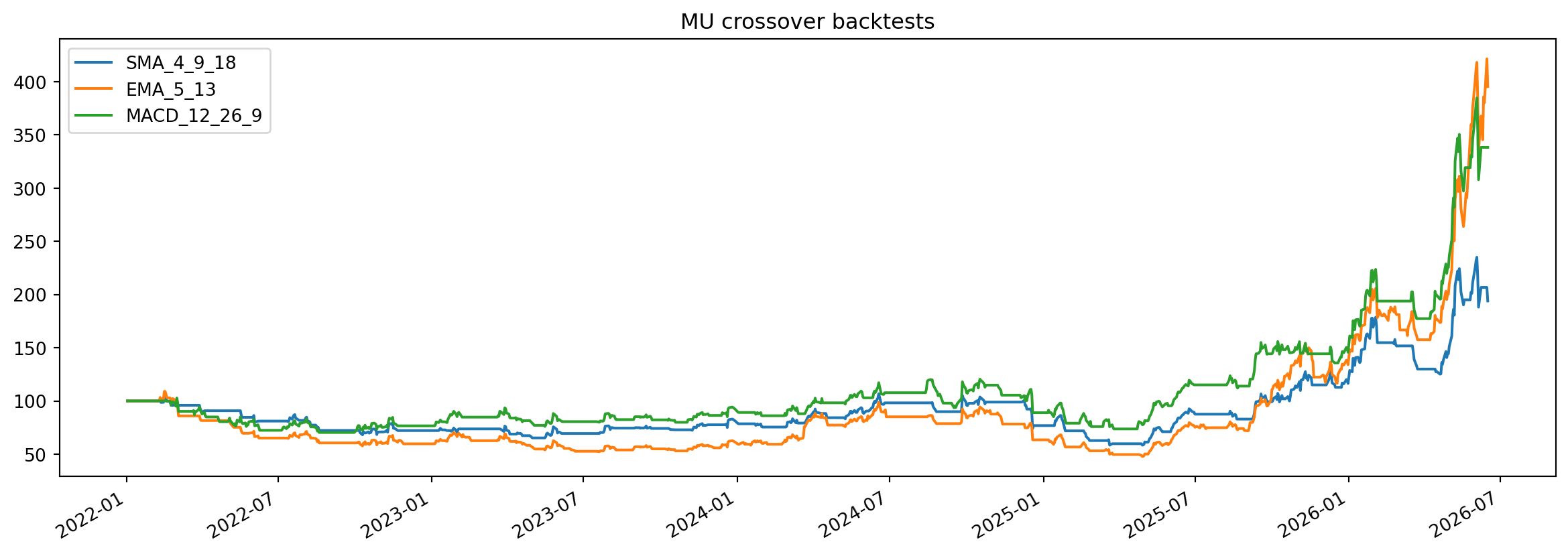
Everything above is technical (price/volume driven). This section adds the fundamental view: is the business growing, and is the price reasonable for that growth? Data is pulled live from Yahoo Finance via yfinance for the current ticker — it’s free data, so sanity-check against the company’s filings before acting on it.
# ===== Fundamentals: fetch + valuation / growth snapshot =====
tk = yf.Ticker(ticker.upper())
finfo = tk.info
income = tk.income_stmt        # annual income statement (most-recent column first)
cashflow = tk.cashflow


def f_ratio(x):
    return f'{x:.1f}x' if isinstance(x, (int, float)) and x == x else '—'


def f_pct(x):
    return f'{x*100:.1f}%' if isinstance(x, (int, float)) and x == x else '—'


def f_usd(x):
    if not isinstance(x, (int, float)) or x != x:
        return '—'
    a = abs(x)
    for d, s in [(1e12, 'T'), (1e9, 'B'), (1e6, 'M')]:
        if a >= d:
            return f'${x/d:.2f}{s}'
    return f'${x:,.0f}'


def stmt_row(stmt, label):
    """A statement row as a chronological (old -> new) float Series indexed by year."""
    if stmt is not None and not stmt.empty and label in stmt.index:
        s = stmt.loc[label].dropna().iloc[::-1]
        s.index = [str(c.year) for c in s.index]
        return s.astype(float)
    return pd.Series(dtype=float)


def cagr(s):
    s = s[s > 0]
    if len(s) < 2:
        return None
    return (s.iloc[-1] / s.iloc[0]) ** (1 / (len(s) - 1)) - 1


price = finfo.get('currentPrice') or finfo.get('previousClose')
fcf, mcap = finfo.get('freeCashflow'), finfo.get('marketCap')
drate = finfo.get('dividendRate')
peg = finfo.get('trailingPegRatio') or finfo.get('pegRatio')

snapshot = pd.DataFrame([
    ('Valuation', 'Trailing P/E',          f_ratio(finfo.get('trailingPE'))),
    ('Valuation', 'Forward P/E',           f_ratio(finfo.get('forwardPE'))),
    ('Valuation', 'PEG (trailing)',        f_ratio(peg)),
    ('Valuation', 'Price / Sales',         f_ratio(finfo.get('priceToSalesTrailing12Months'))),
    ('Valuation', 'Price / Book',          f_ratio(finfo.get('priceToBook'))),
    ('Valuation', 'EV / EBITDA',           f_ratio(finfo.get('enterpriseToEbitda'))),
    ('Valuation', 'FCF yield',             f_pct(fcf / mcap if fcf and mcap else None)),
    ('Valuation', 'Dividend yield',        f_pct(drate / price if drate and price else None)),
    ('Growth & profitability', 'Revenue growth (YoY)',  f_pct(finfo.get('revenueGrowth'))),
    ('Growth & profitability', 'Earnings growth (YoY)', f_pct(finfo.get('earningsGrowth'))),
    ('Growth & profitability', 'Gross margin',          f_pct(finfo.get('grossMargins'))),
    ('Growth & profitability', 'Operating margin',      f_pct(finfo.get('operatingMargins'))),
    ('Growth & profitability', 'Net margin',            f_pct(finfo.get('profitMargins'))),
    ('Growth & profitability', 'Return on equity',      f_pct(finfo.get('returnOnEquity'))),
    ('Size', 'Market cap',                 f_usd(mcap)),
    ('Size', 'Revenue (TTM)',              f_usd(finfo.get('totalRevenue'))),
], columns=['Group', 'Metric', 'Value']).set_index(['Group', 'Metric'])

print(f"{finfo.get('shortName', ticker.upper())}  |  sector: {finfo.get('sector', '—')}  |  price: {f_usd(price)}")
snapshot
Micron Technology, Inc. | sector: Technology | price: $1,043| Value | ||
|---|---|---|
| Group | Metric | |
| Valuation | Trailing P/E | 49.1x |
| Forward P/E | 9.1x | |
| PEG (trailing) | 0.3x | |
| Price / Sales | 20.2x | |
| Price / Book | 16.2x | |
| EV / EBITDA | 31.2x | |
| FCF yield | 0.2% | |
| Dividend yield | — | |
| Growth & profitability | Revenue growth (YoY) | 196.3% |
| Earnings growth (YoY) | 756.0% | |
| Gross margin | 58.4% | |
| Operating margin | 67.6% | |
| Net margin | 41.5% | |
| Return on equity | 39.8% | |
| Size | Market cap | $1.18T |
| Revenue (TTM) | $58.12B |
The headline question: is the business getting bigger and more profitable? Healthy earnings growth should be backed by revenue (top-line) growth — not just buybacks or one-off cost cuts. The bars show the multi-year trend; the CAGR summarises the compound annual rate so a single great/poor year doesn’t dominate.
# ----- Multi-year revenue, net income & EPS -----
rev = stmt_row(income, 'Total Revenue')
ni  = stmt_row(income, 'Net Income')
eps = stmt_row(income, 'Diluted EPS')
print(f'Revenue CAGR: {f_pct(cagr(rev))}   |   Diluted EPS CAGR: {f_pct(cagr(eps))}'
      f'   (FY {", ".join(rev.index)})')

fig = make_subplots(rows=2, cols=1, shared_xaxes=True, row_heights=[0.55, 0.45],
                    vertical_spacing=0.10,
                    subplot_titles=('Revenue & Net income ($B)', 'Diluted EPS ($)'))
fig.add_trace(go.Bar(x=rev.index, y=rev / 1e9, name='Revenue', marker_color='#42a5f5'), row=1, col=1)
fig.add_trace(go.Bar(x=ni.index,  y=ni / 1e9,  name='Net income', marker_color='#26a69a'), row=1, col=1)
fig.add_trace(go.Bar(x=eps.index, y=eps, name='Diluted EPS', marker_color='#ffa726',
                     showlegend=False), row=2, col=1)
fig.update_layout(**PRO_LAYOUT, height=650, barmode='group',
                  title=f'{ticker.upper()} - revenue, earnings & EPS growth')
fig.show()
Revenue CAGR: 6.7% | Diluted EPS CAGR: -1.0% (FY 2022, 2023, 2024, 2025)Margins tell you where the growth comes from. Rising gross/operating margins point to pricing power and operating leverage; flat margins with rising revenue mean growth is being “bought” with volume or spend. The gap between gross → operating → net margin shows how much of each sales dollar survives cost of goods, operating expenses, then interest and tax.
# ----- Profit margin trend -----
rev   = stmt_row(income, 'Total Revenue')
gross = stmt_row(income, 'Gross Profit')
oper  = stmt_row(income, 'Operating Income')
net   = stmt_row(income, 'Net Income')

fig = go.Figure()
for series, name, color in [(gross / rev * 100, 'Gross margin',     '#42a5f5'),
                            (oper / rev * 100,  'Operating margin', '#ffa726'),
                            (net / rev * 100,   'Net margin',       '#26a69a')]:
    fig.add_trace(go.Scatter(x=series.index, y=series, name=name, mode='lines+markers',
                             line=dict(width=2, color=color)))
fig.update_layout(**PRO_LAYOUT, height=450, yaxis_title='% of revenue',
                  title=f'{ticker.upper()} - profit margin trend')
fig.show()Each quarter, reported EPS vs. the analyst estimate. A consistent pattern of beats signals execution quality and shapes how “priced-in” expectations are — a beat can still sell off if expectations were higher than consensus, and a miss after a long beat streak is a red flag. The lower panel shows the surprise %, green for a beat and red for a miss.
# ----- Earnings surprises: estimate vs reported EPS -----
try:
    ed = tk.get_earnings_dates(limit=12)
    ed = ed.dropna(subset=['Reported EPS']).sort_index()
except Exception:
    ed = None

if ed is None or ed.empty:
    print('No earnings-surprise history available for', ticker.upper())
else:
    x = [d.strftime('%Y-%m-%d') for d in ed.index]
    fig = make_subplots(rows=2, cols=1, shared_xaxes=True, row_heights=[0.6, 0.4],
                        vertical_spacing=0.10, subplot_titles=('Estimate vs reported EPS', 'Surprise (%)'))
    fig.add_trace(go.Bar(x=x, y=ed['EPS Estimate'], name='Estimate', marker_color='#90a4ae'), row=1, col=1)
    fig.add_trace(go.Bar(x=x, y=ed['Reported EPS'], name='Reported', marker_color='#42a5f5'), row=1, col=1)
    colors = ['#26a69a' if v >= 0 else '#ef5350' for v in ed['Surprise(%)']]
    fig.add_trace(go.Bar(x=x, y=ed['Surprise(%)'], name='Surprise %', marker_color=colors,
                         showlegend=False), row=2, col=1)
    fig.update_layout(**PRO_LAYOUT, height=650, barmode='group',
                      title=f'{ticker.upper()} - earnings surprises (last {len(ed)} quarters)')
    fig.show()